Worktops Design Guide
How to get the look just right.
Choosing the right colour and design for your new kitchen is not an exact science. A lot depends on personal choice and some people have a natural gift for it while others do not. If you are outlaying a certain expense on your new kitchen, and you have no real aptitude, then you might like to hire a designer to do it for you.
The extra cost is often worth it.
If not, then below we give a few hints and tips to help you decorate the perfect kitchen.
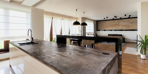
See our granite worktop colour range and get an instant price here.
Get a Colour Wheel
One of the most useful tools you can get if you are going to select the right combinations is to get yourself a good colour wheel.
You can find these on a lot of websites and they can help give you an idea of which colours go with others.
Choose a Colour Scheme
There are three main theories that can be used to mix and match your colours. Which you opt for is a matter for you to decide.
Monochromatic theory: Use one colour in different shades. This can give a calming effect but can also look a little one dimensional.
Complimentary theory: Select two colours which are at opposite ends of the colour wheel. Because the two colours enhance each other, this can be quite an intense combination. For instance, a normal blue will seem far more vivid when paired with a red or orange colour.
Analagous theory: Choosing colours that are adjacent to each other can have quite a stunning effect. Choose the more dominant colour for the main part such as the walls and the less dominant for smaller areas. This often works best when you team up cool colours or warm colours.
Other Colour Combinations
Go neutral with blacks, whites, and greys. Or why not try brown and beige? Using neutral colours requires careful planning and needs to be tied into the colour of your granite or quartz worktops.
Use an accent colour to add a bit of definition. This is normally a complimentary colour that is used in small quantities.
Clashing colours can be an idea, if you are brave enough. Used carefully they can make your kitchen look fabulous. But beware, if you get it wrong, it can be discordant and overpowering.
A lot of our customers will choose their granite or quartz worktops first before they settle on the colour scheme for the kitchen. It makes sense, you can’t change the colour of worktops but you can paint your walls and ceiling.
Whichever colour scheme you go for, make sure you take your time and hunt around for the right materials. Collecting samples before you finally decide is a good idea, as is checking out friends and family schemes and designs.
If you would like advice on choosing a granite worktop in sussex, why not visit our showroom or click here.